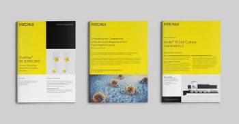
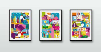
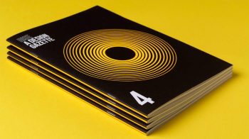
Where Graphic Design meets Content Marketing.
If you like the way we think click to say hello:
07712 270 198 / adrian@adriansableandhawkes.co.uk
The relationship between content and graphic design
In today’s content-heavy world, no one needs to tell you how hard it is to stand out in the crowd. Which is why, when content is on a permanent publishing churn – that design and presentation really become important. Really matter. Beautiful, on-brand, and creative content is proven to outperform bland, copy-heavy material, with a Forbes study proving that 91% of consumers prefer visuals over text-based content.
When you take into account the whole array of content formats available to marketers, simple copy-based articles are just the tip of the iceberg. There are also infographics, videos, quizzes, how-tos, cartoons, animations, webinars… the list goes on. And the majority of content formats are visual. Even the standard blog article needs careful design consideration so that the words come to life on the screen.
Why design matters
Quality design is easier to digest, more likely to be shared, and more memorable. In fact, the Design Management Institute has shown that design-led companies far outperform the S&P index, and a study by Forrester and Adobe has shown that design-led strategies lead to higher customer loyalty.
Good design, graphic design, forms part of your overall brand toolkit, adding colour (quite literally) and depth to your tone of voice and presenting your brand in a way that can be visually memorable. But well designed content also helps your marketing perform better – thought through, designed content will be easier to digest because the way we digest it has already been considered. And if something is more likely to be read, it’s more likely to be remembered and shared.
What is design-led content marketing?
Finding that balance between graphic design and content marketing is what elevates your marketing strategy and the editorial content you create, to the next level. And with experience and skill it is not difficult. It’s simply about looking at your content from a complete package point-of-view, to ensure it’s not just words that are doing the leg-work. You may start with just copywriting, the good old Word.doc but then consider what this could be, from the perspective of your audience.
The most obvious starting point is branding. How can this content be ‘branded’, marked, badged to ensure that your audience knows it is coming from you. If they don’t there is not much point in sending it out. Then how can you combine your copywriting, editing and graphic design skills to bag, chunk and edit your copy to make it as quick, simple and easy to digest as possible. What you say is one thing, this is how you say and the right structure can make the difference between being read and not read.
I always think the old copywriter rules for creating content can still apply to the graphic design rules for designing content. Allow for your audience types, the waders, dippers and skimmers. The waders will delve deeply but still break up your content as much as you can to help them in and on their way. The dippers need summaries – these are the bigger picture crowd so paint that picture for them. And then the skimmers, the flighty one’s. How can we get their attention? Scale, impact, clarity, succinctness, using words and design in tandem.
In summary
In today’s competitive online world, it’s not enough for copywriting, editorial and marketing teams to work in a vacuum. High-quality design not only increases your chances of standing out, but it provides you with recognisablity, makes you memorable, helps build relationships and enhance reputations. If your content is grey, imagine a row of the same grey macs on hangers … imagine that’s your copy, your marketing, your thoughts and leadership … how will I find you, why will I find you? The truth is, I won’t.


